Saturday 22 November 2014

Yet Another Collection of Jobs!


Here we go again! Another giant-sized bundle of jobs...

At various points this year I have been busier than I have ever been in my decade long career in doodling... in fact at times I have bitten off more than I can chew, this became apparent over the space of a couple of weeks when I was drawing many of the illustrations seen on this post.

Above is a double-page spread for the football (Soccer to my American friends) magazine Four Four Two, now I am a big footie fan, and a real fan of the publication too, originally I was offered a spot illustration for the title, which I had to turn down due to a ridiculously busy schedule.

I hate turning down jobs, particularly if it's for a title you really want to work with, but I only have one set of hands and if I am committed elsewhere, then there is not a lot I can do.

Luckily the Art Ed Tom Chase wasn't deterred too much and offered me this much bigger job a few weeks down the line... unfortunately I was still kind of over-committed with other clients, but I just didn't want to turn such a great mag down again...so I kind of made a bit of a mistake and took the job, and tried to crowbar it into my schedule... which proved tricky!

The article I was illustrating for the mag was about fans missing important goals, which was great fun, but I probably did not realize how much work was going to be involved with these.

I'm kind of happy with how they came out, the image above looking nice on the double page, but it proved quite stressful for everyone involved I think.

I'm very thankful to Tom for keeping a level-head and putting up with my whining about how busy I was.


Here are two more from the article (I think there may have been 7 drawings in total, including the double page!) there was a lot of back of head shots with these, generally I am not keen on drawing backs of heads, all artists have one or two bugbears when it comes to drawing, I don't think i've ever said it here before, but backs of heads is one of mine... it's hard to emote things when all you can see is ears and hair.

Regardless I think these came out okay, only thing I would change is the red head on right on the bottom drawing, however to put it in perspective, both of the stewards in the bottom illo were originally both men, and had to be replaced in super-quick time.

Like I said earlier big thanks to Tom, and hopefully i'll get to work with the title again under less stressful conditions... y'know that's if I haven't put them off by my bellyaching!


So as I have already stated I was pretty busy for a period there, I was working from 6 in the morn while 6 in the afternoon for two/three weeks solid (no weekends off)

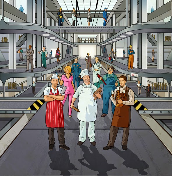
Above is an illo I was working on at the same time as the Four Four Two drawings, this was for the cover of Insurance Age.

The idea was a beauty, a conveyor belt of different kinds of self-employed careers, with the "butcher, baker, candlestick maker" standing at the front of the queue.

I think under less stressful times, I would have packed this drawing out further with more people and details, but generally speaking I though this came out well, this was art directed by long-time client Dan Parker over at Incisive... Dan's always great to work with.. Ha, even when i'm a complete stress-head!


This is the second cover I did for Legal Week, which was used for a various promotional purposes across a variety of platforms.

I spoke a little about this on a past posting, the first one we did was great, I suppose this one was more of the same, but by not working with the same experienced art director that I had on the first job (hello Dan again!) it resulted in leaving me in some pretty sticky circumstances and resulted in this final drawing being completed in two days, despite, having a month to run through roughs and ideas, etc... Looking at the image with fresh eyes having not viewed it for a couple of months, it's pretty good I think.


Some at work exercises for Fabulous magazine, quick turnaround, I like the AD there Laura Cunningham, she's lovely to work with. 'Nuff said!


A job for regular letters column at Top Gear mag, this came at the end of my busy spell, under a tight deadline (I was working on other jobs) and this was drawn in one day, in fact it was a Sunday I drew this in between tucking into my Sunday roast.

This was for an article about a Hyundai virtual salesroom, complete with naff salesman hologram... I quite enjoyed this, a bit more simpler than some of my stuff. Art directed again by the great Peter Barnes!


Above are a series of spot illos for Empire magazine, obviously doesn't even need to be said for any regular readers of this blog, but it's a thrill for me whenever I get an Empire brief.

These illustrations went with a sidebar to a feature about the Hunger Games, the article was about the death toll, and variety of deaths in popular YA (Young Adult) films, like Maze Runner, Divergent, etc
See if you can name the films.

This would have been a dream job, but I was already drawing those illustrations for Four Four Two and Top Gear at the same time, I got this at exactly the same time as the Top Gear job with the same deadline... which meant that I drew these, the TG job and finished up the FFT images all over the same weekend... it was shattering!

I have one rule... never turn down a job for Empire! Simple as that... They are the one client, because I have been reading the magazine for most of my adult life, and one day aspired to work with that i'll move mountains in order to work with them, regardless of what work I have on, or if my arms fallen off, i'm in hospital in a coma, whatever, there's always time for Empire.

This one was art directed by the always ace Adam Gerrard.


Finish up with some lovely (but gruesome!) jobs for his awesom'ness, the one and only Ped Millichamp at Men's Fitness.

First up to celebrate Walking Dead returning to our TV screens, here's how to evade a zombie exercises by Rick (Andrew Lincoln) from the series.

I am a massive fan of the show, and it is right up there with Game of Thrones as being the best thing on Telly, so I was honored to get the brief for this one... again other jobs to contend with, probably would have liked more time to draw the zombies, but what the hey I can live with it.

Bottom and final illo is for the regular MF feature Top Tweets, this time about Simon Pegg getting into shape.

We did a Shaun of the Dead style gym scene.. I remember struggling with the perspective on this, because Pegg is so low down, and our viewpoint, etc. Also an issue was trying to get the body shape for Nick Frost correct, i've spent too much time I think drawing so many people that are superhuman physical specimens that when I draw a regular body shape I now struggle.

I think we got there in the end on this.. at the time I though I hadn't perhaps done my best work, but seeing this one in print, it just really worked on the page.

Best two bits for me are the twitter bird eating zombie brain, and the female zombie who's hands fallen due to the weight of a dumbbell.

Right that's me done for now, expect another big jobs haul here before the New Year... and I suppose the other bit of news is that I am looking to join the Twittersphere  (quick as ever with these things!) either sometime before Christmas or just after, I think me and Twitter will do extraordinary, but terrible things together... just you wait and see!


Wednesday 29 October 2014

Harry & the Hendersons Print Now for Sale!


So another super busy month with magazine illustrations, rather than jump straight into another great big job round up post (that'll come in the next couple of week!) I thought I would post this up, one of my personal pieces produced not just for me, but I suppose for the fans of my other 80's themed images.

Above is my painting of Harry, from classic 80's Ambin movie Harry and the Hendersons, sometimes known as Bigfoot & the Hendersons.

I've had many forays into digital painting, but it's something that has taken a backseat, because it's drawing rather than paintings that my commercial clients want, I thought Harry would make a good choice for the first of a planned series of oversized 80's themed painted portraits.... that is if I every get around to doing the others! Things have been hectic here at McConkey Studios!

The top image is the original, and the bottom two are photos of the giclee print made from the original file (they came out very faithful to the top one, you'll have to forgive the quick snaps)

This print is now available for purchase on request.

The images comes in these ways:

Giant sized A2 Giclee (best print money can buy!) on archival fine art paper that's a width of 420mm by 594mm height, which is 16.53 inches by 23.39 inches, this is the largest and most expensive print, the price is £50 to the UK market and £65 overseas.

Second print is the A3 Giclee on archival fine art paper, same quality as above, but smaller and measures 297mm (width) by 420mm (height), which is 11.69 by 16.53 inches, the prices are £40 to the UK and £50 overseas.

There are also two poster prints available:

A2 Vinyl banner print (see A2 giclee for sizes) at £20 in UK and £30 overseas.

A3 (see A3 Giclee for sizes) at £8 in the UK and £20 for overseas, this comes with another poster print thrown in.

If you'd like to own a print, then drop me an email, my address is at the top of this page in the banner, or alternatively click on the website link, which also lists my contact details.

* Just a note here, if you are going to repost this image elsewhere, whether it be on Facebook, Twitter, your blog, Pinterest or whatever, I have no issue with that, but if you could kindly attribute and acknowledge me as the creator and this site as the original source, that way should anyone see the image and want a print, they know where to come.


Friday 26 September 2014

The Gigantic Job Collection!


Okay so let's face it, I think I begin pretty much each blog with an apology about my tardiness in posting something here, because of a hectic work schedule... well i'll not do that again, but I think this past month it is fair to say that all previous busy spells have been blown out of the water, by the sheer volume of work to come my way since the release of Kaleidoscope.

So what we have here is a bumper scale post of recent work.

I'll start with one of the most recent images to see print, a cover for the renowned Guardian Guide.

This was an odd one, in that Sara Ramsbottom the AD of the Guide actually hadn't received a copy of the book yet (I was biding my time) an email just came somewhat out of the blue to ask whether i'd be interested in a cover.

Now I am of the opinion that the Guide often has some of the best illustrated covers out there, and I found myself in the regrettable position of having to turn down this job as I was booked in with about 5 different jobs.

It can be somewhat heart-breaking for me to be in this position, especially when you hear the brief, and let's face it who wants to turn down Sara and the Guide.

Anyway somehow Sara was able to talk me around, even though I simply didn't have time... luckily some of my more regular clients were able to push back a few deadlines, and were very accommodating (thanks Dan, Peter, & Ped) so I was able to squeeze this in.

The illustration is of the stars of ITV2 Roman era set comedy Plebs.

Ha, I'll not go through how stressful it was to bring this cover to fruition over the space of a weekend while juggling other jobs.

One of the reasons I had not yet sent Sara one of my books (It's on it's way to you next week Sara!) was perhaps a feeling I had blown my chances with the magazine, after I had produced what I felt was a lackluster effort on my previous cover, some two years ago (btw, not art directed by Sara) fortunately this opinion was not shared by Sara.

Despite the speedy turnaround of the job (I would have made the arrows better, and walls more crumbly with more time) I was actually really, really pleased with this in print... in fact i've shown this to everyone, and it's an image i'm really proud of... thanks Sara, for thinking of me for this, and hopefully i'll produce more work for the title under slightly less stressful circumstances.


Wouldn't be a proper post without some work for the gang at TopGear magazine, here's a bunch from the monthly Ask Uncle TopGear column.

I'm very grateful to the team there for allowing me the regular opportunity to doodle for the title, and recently for Peter the designer there giving me a bit more freedom in composing these pieces more to my liking.

As previously stated I work in a more realistic "tight" style for the title, without the time used on these assignments to fine tune the technique, images like that drawn for The Guide above would simply not be possible.


A selection of covers for my long-time friends at Incisive.

Above is a cover for Insurance Age, a magazine i've just produced another cover for this week, this one was actually completed a while back, before things went a bit crazy.

Illustration was for a feature about building insurance, brief was simple, drawn an insurance fella in front of a disaster building... like this image, would draw the guy's shadow better if I had the time back ... apart from that, always a pleasure to work with Iain at the title, he's one of those people I'm fortunate to work with who y'know "get's it", he knows how to use me, gives me decent briefs, and enough time to produce the final drawing.


This is a rare cover for Financial Director magazine, this was actually drawn ages ago... i'm not sure why I have delayed in putting this up, I think maybe the idea was that I would do a Financial Director special post, with all the spots I draw for the title.

I draw 4 regular spot illos for the title, so I've produced a large number of images for the title over the past few years, some I would argue are conceptually (at least) my best images... anyway enough about the spots, i'll do a feature on just them next post.

So the cover was..er..about floods (well d'uh!) this image is a lot more simpler than what I usually do, and for me this recalls the work of the American conceptual illustrator Guy Billout (exceptional artist!) the waves were used as a framing device for a headline placed on by the designer, I can't remember seeing the final layout, but I imagine this would work beautifully.


This is the first of a planned series of 3 images for Legal Week, and a Legal Week promotional series of conferences.

I was given headshots of a group of leading Legal heavyweights that would be attending a conference in Lake Como, Italy and asked to compose an image.

I did something similar last year albeit not as well as above.

These kinds of images (advertorials) are often difficult, and fraught with possible minefields, as there's a hell of a lot of people involved.. all with differing opinions, i've done my fair share of this work, and it can prove troublesome.

This one was art directed by Dan Parker, someone I trust, and knows what he is doing, sometimes us illustrators need to be protected a bit, otherwise an image like this would get crushed under the deluge of alterations and nit-picking.

Luckily with Dan on board this one proved pretty smooth sailing, the second one in the series got signed off yesterday, after being on the project for a month and a half... Ha, that was a far more tricky affair, arguably less successful, and didn't have Dan art directing, 'nuff said!


Sometimes it's not what  you know, but who! This job came courtesy of Nuts alumni, Nitish Mandalia who was freelancing for Britain's biggest tabloid The Sun, for their Sunday supplement Fabulous and a football special called OFFSIDE.

The above job seemed easy on paper... proved far more difficult in execution, usually when I do these kind of jobs, i'm given a very specific set of instructions and often photo reference (to interpret as I see fit) there was little of that here, and I made the mistake of following the designer's instruction as opposed to the 'copy' text... took a long time to get them right.

I think most artists will tell you, the more times you ahve to re-draw an image, the more labored the process becomes, this happened here.


These were exercise illos done for OFFSIDE, art directed by Laura Cunningham, I was on far more comfortable ground with these, these printed great in the magazine.


This was another one for OFFSIDE, i'd long wanted to draw Harry Redknapp, his hangdog expression is calling out to be illustrated, so I was happy to finally get my shot.

This was about the phone ringing off the hook on transfer deadline day, the issue with this one was that one of my most popular images (a portrait of Bill Murray) proved a little too popular with the art team, and I was essentially asked to re-create it with Harry Redknapp.

I am relatively happy with the piece, but perhaps there was a missed opportunity with this one.. i've certainly got a better Redknapp illustration in my locker.

This image has a Warhol-like Pop Art feel to it, several weeks later The Sun brought out a "Reality Show Rich List" supplement with all the major players illustrated in pretty much the exact same way as above, albeit without me on board.

I can't complain too much, the illustrator did a cracking job, but make no mistake this work sowed the seed... still it was a pleasure to work with Nitish again, to work with such a big publication like The Sun, and also to work with Laura and Mark at the magazine, who i'd work with again in a heartbeat


'Nother one for The Sun, this time for Fabulous magazine. Art directed by Laura Cunningham, these were enjoyable, pain-free and I rarely just do B&W line work.


Okay now onto some spots for my friends at Empire magazine.. everyone knows I am a devoted reader, so i'll not bore everyone with the fanboy type glee that comes with a commission for the title.

Above is a set of images from a feature about Sin City 2, these were for a box out in the main feature, which asked for some funny drawings of Robert Rodriguez inspired pet drawn in Sin City grey scale.

Above are Deperadog (El Mari Chihuahua) Spy Kids (as in Baby Goats, get it?) From Duck 'Til Dawn
and Planet Terrapin... I really loved these in print, I remember stressing about the terrapin one.. now I think it's the best of the bunch! Yep, doesn't matter how small a drawing prints.. I can still stress about it!

More spots for this Month's Empire, this time the new faces of horror. I'm a big horror nut, and I like the new breed of horror films currently being made like Insidious, so this was one of those that was made for me.

Above is the woman from Woman in Black (sorry forgot name!) Annabelle from The Conjuring/Annabelle, Mr Boogie (doesn't look like much of a mover!) from Sinister, Red Face from Insidious and just for fun a Minion from Despicable Me.

Love these jobs, so much fun, and Chris and Adam are just the best to work with. When I draw things like this, I realise what a lucky so and so I am!


Above is the first job I did for new client Men's Fitness.

This came about not unlike the job for The Sun, Ha, in that I had a friend on the inside.

An art director called Camille Neilson who I had previously worked with at PC Pro and who had very kindly written a feature on me for Mac User had recently left her desk as a full-time AD and gone freelance, we'd kept in touch in that period.

One of her many jobs (she's a very busy lady nowadays!) was a period working for the gang at Men's Fitness, where she promptly showed my work around (who needs an agent with friends like this!) an introduction was made with the AD of the title Ped Millichamp... We also have Camille to thank for giving me the much needed kick up the backside in updating my website (new pictures on there soon!)

I was promptly offered the set of Action Man exercises above, which were great fun to do.

Now what I should say here, is that I was actually biding my time before actually sending my book Kaleidoscope out to Men's Fitness and Ped... because he was at the top of the tree amongst art directors  I wanted to work with, but as of yet, had not had the pleasure.

I am the biggest illustration geek... possibly in the world, my knowledge is straight out encyclopedic, if I was on Mastermind, that would be my specialist subject, and I would probably win!

Anyway, I not only follow work of illustrators, but the art directors that commission the best illustrators, to use a football analogy, if us illustrators consider ourselves the players, then the Art Director's are the managers. Top players want to work with the top managers, simple as that! And Ped's one of the Best.


Thanks to Camille's introduction, I've had the pleasure of working with Ped over the past few months, above are a set of exercise illos of MMA fighter Luke Rockhold, once you work with someone like Ped, you realize why their reputation and standing is so high in the illustration community.


More exercises for MF, this time of muscle-bound funny man Terry Crews (arguably the best thing about any film he's in!) lots of fun to do.


This is the first of (hopefully!) a series of illustrations for a column called Top Tweets, published each month in the back of the Men's Fitness, clever idea, and very suited to my likeness/celebrity culture driven work.

Each month the feature highlight tweets by the famous that relate to exercise, this first one of ("World's Fittest Man"tm) Richard Fronning I remember being a bit disappointed with, I felt I could do better, but with the amount of work I had on, I felt a bit compromised... I shouldn't have worried so much, came out great in print.. best bit, body-building gnome!
Okay final one! this is again for the Top Tweets section in MF, with Hugh Jackman as Blackbeard (in the new Peter Pan film due next year) putting his back into a bit of exercise.

Felt far more at ease with this one, and it looked lovely in the copy I picked up yesterday... best bit, weightlifting monkey!

Right, now that was epic! Believe it or not, this is still only a selection of everything i've done, as a lot of it has yet to see print as it was completed in the past two weeks or so, which means due to contractual obligation I cannot show them here yet... of course, that means expect to see yet another gigantic sized posting here in the next few months!

Thursday 21 August 2014

Brand New Website!!!!

Just a quick post here, after years of having a rather outdated website, i've finally got around to giving it a complete overhaul.

At the moment, it's only got a small selection of my very best images produced over the past five years, i'll be adding further pictures over the coming weeks.

As I am now in the driver's seat on this one with regards to both the design and upkeep, expect this one to be far more up to date, with me adding new stuff on a very regular basis.

Good thing about the current site is that it is also built with I-Pads, tablets and phones in mind, and it works a dream on these.

Check it out by clicking on this link: http://www.billmcconkey.co.uk/ or alternatively by hitting the "My Website" link at the top of this page.

Big thanks to Dean Hubert, the guy responsible for putting up the first site, for all his help with the technical stuff on this new site.

Take a look, you won't be disappointed!

Friday 11 July 2014

Kaleidoscope-The Book!


So here it is finally! My long in gestation book Kaleidoscope: The Rise of an Illustration Supergeek, the picture above kind of doesn't do them justice.

It's taken me maybe 6 months to put this thing together, then it's been with my printer a further month in order to knock it into shape, proofread (over and over again!) then there's the the small matter of getting this thing printed and bound.

At the moment of writing this, 50 have been printed and are now on their way out to clients, we are printing these in batches, and I expect another batch of 75-100 to be ready next week, and so on until we meet my order of close to 300 books in total.

It's been a tiring and slightly epic experience, but I am really happy with the final product, here's the vital stats; the book is on silk paper with silk card cover, it weighs in with a hefty 140 pages and is perfect bound.

This book showcases the drawing work i've been producing for many of the UK's biggest magazines over the past 5 years, these include pretty much everything that's on this blog and a lot more besides.

While it concentrates on my drawing work, there is also a pretty comprehensive biography that tells my tale from childhood illustration fanboy to practicing professional, and all the trials and tribulations of trying to earn a crust in this profession for over a decade.

Any Art Directors that reads this blog (and I know there are quite a few) who would like a complimentary copy should get in touch, for any fans of my artwork, copies may be made available in future for a small fee (covering shipping, etc) on request (email me)

This book has almost got the better of me at times, with me being really quite ill and stressed throughout periods of getting this thing together, but now we are I think on the home stretch with it (I hope!)

Special mention should go here to my printer, Darren at Carter & Jackson printing that have worked extremely hard to create an item that I think we can both be proud of... check out the link for the best printers in Yorkshire, if not the north of England!

Ha, I think it's been a learning experience for the both of us, what with collating and binding this mammoth tome!

Okay onto some pictures, that's why people check out this blog in the first place! I thought one of the things I could do in my book, is along with all the published stuff is to put a special section in, where i've experimented with different techniques and processes.

When I look on the newsstands today there seems to be an inordinate amount of people that.. well i'm not going to say copy me... but stylistically speaking have kind of jumped on the bandwagon.

Now imitation is one of those things that is part of the profession, when I started out my own work was a poor man's version of that slightly ethereal dark photoshop stuff that Dave Mckean was producing mid 90's to early Noughties.

Even the drawing stuff I do now, came about from trying to capture that comic book influence from my childhood, and when traveling the US coming across illustrators that use line like Tomer Hanuka, etc

When I started drawing my work instead of collaging/digitally painting like I had in the past, I know for a fact that at least two illustrators in this country were already creating work along the same lines, and could creditably lay claim like myself to being originators of this style of work, both are great artists that work on various top titles.

Still the whole thing reminds me of super design/illustration outfit Vault 49, who mid noughties almost single-handedly created an entirely new more decorative aesthetic to illustration, which for a couple of years kind of swamped the market, and this happened because everyone jumped on board that "look".

My agents at the time, must have hired about 30 other people that imitated their work. Of course fashions are a fad, and slowly that work became less and less popular, leaving many of the imitators scratching around for work, but not Vault 49 with them kind of being the original source, they were always in the position to innovate and adapt.

Their work takes on all kinds of aesthetics and continues to be amazing.

So over the years I expect my work to adapt and change; the images below perhaps showcase the direction my work may take... also for me, this is playtime, an artist should always experiment and play with materials, technique and subject matter in order to grow.


The three images above combine drawing with collage, it's something i've been intrigued with exploring for a long time, these are early efforts, but I think there is the start of something here, and it's not something I think i've seen anyone do before.

I've collected paper ephemera for years with a mind to start producing collages, these are the first few images that look to utilize this material.

At the top Sherlock Holmes, middle an illustration of Dustin Hoffman from the TV show Luck (you can tell i've been practicing a while, as that show is no longer on!) and the bottom one is a portrait of the late, great Stanley Kubrick.

I feel I'm just at the precipice with this work, and providing I proceed (they are fun to make!) that I could make some extraordinary images.


A case of stripping back with these three images, there's one side of me that wants to make the most ridiculously detailed images ever (like the He-Man print) and the other side, that wants to make images that simplify and essentially be distillations of a subject, to be more direct.

The three portraits above, of William H Macy, Jack Nicholson and Johnny Depp were created with charcoal pencil and lino block ink, scanned, cleaned and put together in Photoshop.

I'd love to do a series of these portraits or images for a lovely high-end magazine, utilizing this technique, with them maybe running full page.


These next two portraits use many of the techniques above, but concentrate perhaps further on line, the desired effect was to make these slightly more quirky than the above three to represent these actors indie credentials (a lot can be said with the line you use)

Portraits are of Maggie Gyllenhaal and Ryan Gosling, I think Maggie's been high up on my list of people I want to draw for a long time, I think she has a beautiful face, but not one that's overly "Hollywood".


Same technique as with the Ryan and Maggie drawings on these two, but again used to illicit a different result, stripping back to just black and grey, these actors exude gravitas, there's no need for "fireworks" with these drawings, no fancy line weight, colors. Just honesty.

Think something like these would look stunning in something like GQ, Esquire, Vogue, Intelligent Life, The Guardian, etc


Okay final two, blimey this blog's been pretty grande, These are two of a planned series of miniature GoT miniature prints.

On a previous blog posting with a Breaking Bad image I started playing with a technique that kind of had an etched feel to it, along with collecting old ephemera for collage for years, I have really fallen in love with the look of old money, engravings, stamps, match boxes and generally old printing techniques.

The above two images of Tyrion and Daenarys look to recreate something of an engraved look, with a bit of luck and if they prove popular I may look to create a huge series of these based on the main show characters in this style, creating something of a huge tapestry of miniature etchings.

This style is just a sideline, that I dare say may come in useful for commercial purposes should a client ever want an oldie world look, like a map of Middle Earth, or portraits from a fantasy series LOTR, for instance... Ha, Chris and Adam at Empire i'm looking in your direction as I write this!

So that's it for now!

Just a quick mention here, one of my regular print buyers from across the pond in America, who has been a real champion of my work for a while now, has very kindly set up a facebook fanpage in my honor, which is lovely.. especially as I haven't got a clue about FB,Twitter and all that stuff.

Here's the link, check it out: https://www.facebook.com/thebillmcconkeyfanpage

Wednesday 4 June 2014

New-ish Drawings!


I am really behind on updating this blog with drawings, some jobs going back as far as last year are still yet to make an appearance!

I'll jump straight in first with a recently published piece and work backwards from there, above are some spot illustrations for the World's Greatest Movie Magazine EMPIRE. Lovely job, simple brief too, I was given a list of movie characters to draw, doesn't get easier than that, right? Er.. apparently it even this I struggle with, as I thought i'd drawn all the characters and was kicking back and relaxing when Empire AD Chris emailed me to tell me I had missed a character off the list!

I re-read the list and he was right of course , for some unknown reason I did not write the character.s name (bottom right) in my sketchbook... Y'see, I no longer print off briefs like I used to, a case of me doing my bit for the environment, and of course with having email on my phone, the brief is always at my fingertips if need be.. I rewrite the main parts of a brief on paper, and go from there to sketching... a rare example of me here not concentrating, alas all was well and good and I got the drawing to Chris the following morning.

See if you can name the films these characters appear in, most are obvious.


Above is another set of spots drawn for EMPIRE last year no less... Not sure what the delay has been in posting these up.

Lovely brief again, the fellas at the magazine spoil me sometimes... these were printed tiny, crossed fingers they'll let me draw something full page for them one day!

These were for a section about Movie Cryogenics, again see if you can name the movies.


Above are a few drawings from the final issue of Nuts magazine. As written on my last post, Nuts has been one of my most ardent supporters and a regular commissioner of my work for a number of years now.

I was very sad to hear that the title would be closing it's doors, and not just for the obvious reason that my income will undoubtedly have been dented somewhat (although i've not felt it yet, busier than ever!) but actually there are many reason why I will mourn the passing of the title.

I will first of all miss the interaction with the Art team there, which consisted of 4 members; Simon Freeborough, Barney Hammond, Nitish Mandalia, and James Jarman, and they were to a man all great to work with, giving me great briefs, paying fairly and really made me feel like I was contributing to the the title... but more than that, I do think of them as friends, rather than just clients.

As it was weekly the deadlines came thick and fast (how I like it!) and I don't think i've worked with a harder working team in my life.

I also think something is now missing from the world of magazines since its demise, Nuts was in it's way kind of fearless, they pushed the envelope on many occasions, in fact my drawings often pushed the boundaries, there are images that are in my portfolio that simply no other magazine would of had the bottle to publish (Ha, some may say good taste!) and regardless of some of the negative press the publication has garnered over the years, I am extremely proud to have my work associated with the title.

These drawings were for a feature about the many stars that Nuts writer Rich Pelley had managed to aggravate over the years (told you they had some bottle!) Amongst a rather large list of celebs, who'd acted in a some kind of diva-ish way were Gordon Ramsay, the late Steve Irwin and Dizzy Rascal.

These were just the best three I drew for the feature, there was also drawings of James Corden, Jason Statham and a variety of others.

All of these images were animated in some small way for the IPad edition, below is an example of how this may have looked.

Just want to say a big thank you here to Simon, Barney, Nitish, James and the whole Nuts team for giving me such great things to draw over the years, it was an honor and a privilege.

Next up: Kaleidoscope, the Book!