Friday, 10 September 2010

New Accountancy Age Cover


Here is a new illustration for the cover of Accountancy Age, which went to print Tuesday.
I really enjoyed myself with this brief, Dan Parker AD at the mag came to me with this idea of a business fella in a supermarket browsing for Accountants; they would be in boxes and on a sale stand... which I thought was a great concept.

When I started drawing it out it dawned on me early on that my original composition (none of the above) would work as it concentrated on the figure too much, where as for the purpose of telling this visual story, the "For Sale" aisle should be equal if not more important than the figure.

I quickly sketched out three thumbnails for Dan to pick from, that showcased the boxes and aisle better, he chose the third one from the sketches above.

I worked up a black and white rough, and got this over to Dan the next day, once this was approved I moved to final artwork.

I had the weekend to complete the final colour artwork; I went a bit crazy on the detail on the boxes; I must admit it's these little things that I enjoy and sent in on the Monday.

There were quite a few alterations to make, but these were just changes to Accountant names on the boxes so that they didn't infringe or promote the names of real accountants.. it got a bit confusing there for a while, just because any name you can think of is taken by an accountancy firm somewhere, that and I had quite a few different versions of the artwork on my hard drive, so I had to make sure my alterations went on the right file(s)!

At the top is the artwork as it was printed, I've really enjoyed these jobs for the nice fellas at AA; the fact is they know what they want, have a good understanding of what I do and set great briefs...what more could an illustrator ask for?!!

Tuesday, 7 September 2010

Sci Fi Art Interview

I recently did an interview with the extremely talented Mr John Freeman as a run up bit of promotion for his new book Sci Fi Art Now, a book that I mentioned on a previous post; it features some of the greatest examples of SF Art and also showcases a few of my images in this genre.

The interview can be found online here Over the next few months up until the time of release in October there will be a series of interviews with the various contributors to the book.

So if you follow my blog and want to find out a bit more of my history, techniques and thoughts then get over there for a quick look.

If you are a fan of illustration and SF Art then this comes with my highest recommendation, as there is going to be an array of the finest talents in this particular genre on this site over the next few weeks and months... should make for a great read!

Monday, 23 August 2010

Mac Format- Steve Jobs


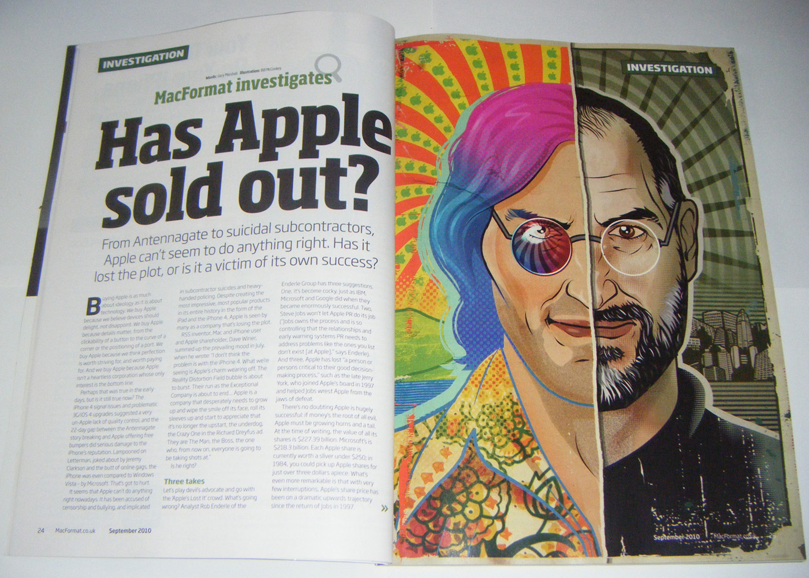
So here's another illustration for Mac Format that hit the stands last week, again this was yet another great brief by the Art Editor of the title Alex Thomas.

The article is about whether Apple has sold out, the brief asked for a depiction of Steve Jobs; one half being the young idealistic computer nerd that grew up in California, the other side showing a more hard nosed, money driven version of the Jobs of today.

On one side I was going for a psychadelic poster style, hence all the halftone stuff and on the other side I wanted to give it an ever so gentle feel of the US Dollar to suggest that corporate materialistic side.

This is one of those that really comes alive in print as it is bold composition..how many times do you see a headshot like that take up a full page?! And also there is some quite subtle line work on the corporate half that really comes through in the printed version.

I'd like to point out that an illustrator's work can often defined by the person/people he works with as much as any brief, or deadline and luckily working with Alex is a joy, he's one of those really good AD's; (a) Because he gives great briefs (b) He always sets a reasonable timescale, and (c) Alex is one of the most visually aware AD's I've met, if I say that I've been looking at this artist/movement/film/comic/TV series as reference or influence, then he totally gets what I'm talking about... it just makes things so much smoother when the guy you work with knows his stuff!

I've done two images for this magazine so far and they've been pretty solid illustrations, but I know if I'm given the opportunity and with these kinds of briefs I'm going to produce something pretty special soon.


Friday, 13 August 2010

Wired!!


Here's a job that I did for the UK edition of Wired magazine, I actually did this quite a while ago.. in fact the World Cup may very well have still been on! however it didn't see print until the end of last week, each magazine has a different schedule; some images see print literally the next day and others take a while like this one.

Wired like the Mojo gig earlier in the year are one of those clients on the list of every illustrator in the land... not only that but I'd tried on numerous occasions over the years to work with the art directing duo of Andrew Diprose and Gary Cadogan on another title, each time my approaches were spurned.

Luckily i'm patient, and as the saying goes; "Good things come to those who wait" so Gary get's in touch having received one of my 'World Cup Wonder' trading card sets with a really lovely brief about Zombies; which is fast becoming a bit of a specialty subject for me, and of course I take it without hesitation.. if truth be be known I'd have drawn anything they told me to!

Tricky job this, in that there were a lot of characters to draw, and they had to be grouped in a particular way, and to take into account the gutter, but I was given a decent deadline so I got to work.

The thing is with this; after years of waiting and now having finally got the commission from Gary, it turned out that Gary was going on to pastures new, so I would be working with Andrew for the completion of the image... I like to think it's like Dragon's Den where you get two for the price of one!

Luckily the reason these Art Director's have such a great reputation was completely justified and I found working with Andrew to be very smooth and professional, which is just as I would have expected.

To be fair I thought if I ever worked with Wired it would be on some of their spot illustrations, in the end I got a big one running over two pages, which was lovely! I still however have my eye on doing some spots for them, check out the magazine as I think they are one of the few magazines on this side of the Atlantic that really know and value the use of the humble 'spot'.

Above are the rough, which is again detailed (there was a lot to work out!) the pinks on this are telling the AD where i'll be putting other stuff, and the other two images are the final and final in print.... Oh yeah, and the Zombie bottom right is me sporting the hairline i'll have in about twelves months from now...


Thursday, 22 July 2010

Accountancy Age Cover 2!


Sorry haven't had time to post up anything in a while, but if i'm not putting things up that means I'm too busy actually making the images to post up, after a hectic couple of weeks you can expect an update-a-rama, just as soon as the various things i've been working on see print!

Above is the latest cover for Accountancy Age which I completed it over the weekend and sent it in on Monday, having got the brief on the Thursday afternoon and it was in print as of yesterday (Wednesday)

This one was ably art directed by Dan Parker.

Strange one this in that it should have been a simple one, the brief was: "Can we have two versions of the same fella outside the Royal Courts of Justice; One looking smug and pleased with himslf and the other looking glum and downbeat"

Easy, right? Well I struggled with it... it took me ages re-drawing the glum fella on the right, messing about with different positions and faces, in the end I went for something far more simpler, which is exactly what I should have done in the first place.. in fact the fella on the right was completely drawn from scratch and added a couple of hours before I sent the final! But i'm glad I re-drew him as he wasn't working at all in the original..maybe a case of me trying to be too clever!

Goes to show you; Ask me to draw a man sprouting ornate psychadelic butterfly wings or a Predator made out of bacon, and that's easy! This needed a far more restrained and subtle approach.. and I can tell you I was sweating a little bit there for a while... but we got there in the end!


Thursday, 24 June 2010

Bacon Predator vs Alien Kipper


So here's another 'Snack Off' illustration for Men's Health UK, the Art Editor of the title Rob Milton came to me with possibly the most 'out there' concept of the series so far, email went something like this; "So we were thinking of Bacon Predator vs Alien Kipper?"

My initial response was "What the?! How am I going to draw a Predator made out of Bacon?!!"
As it turns out I now think Rob is perhaps a Genius! Both for coming up with the concept and believing that I could draw such a thing.

Above are both the Bacon vs Kipper illo and also just the Bacon Predator by itself in all it's greasy glory.

I happen to think that while only a small illustration, that the Bacon Predator features some of my finest drawing of the year and certainly the best in this series so far.

Wednesday, 16 June 2010

World Cup Wonders


The whole world's gone World Cup crazy and I thought i'd get in on the act too, so to celebrate I've created a limited edition set of football cards as a mail out to clients.
It's proved quite difficult to complete these, they were initially going to be sent out a week prior to the opening ceromonies, however more and more jobs cropped up and they didn't see print until the actual opening game, they were sent out the following day and should have found their way into the hands of art directors up and down the land on the Monday/Tuesday just gone.
Hopefully all the designs speak for themselves, at the top are a handful of the printed cards in their sleeves, the way they will have greeted any art director fortunate to receive a set.
These cards are very much a throwback to my own childhood, collecting footbal stickers and a particular influence of note being the Garbage Pail Kids cards of the 80's, if I'd have had more time I would have liked to have produced a lot more of these cards, perhaps with the backs combining together to make one big image..maybe next time!
If you're an art director and haven't received a pack of cards, then get in touch and let me know, although I should warn you that numbers are already dwindling!